Final Pieces & Evaluation

These are how the final pieces looked once they were completely finished.


Overall i am satisfied with the work i have produced for this assignment i think that from my last assignment i have learnt new skills and techniques that have allowed me to create better pieces as a result. A lot goes to my tutor who has incredible talent in photomanipulation he has taught me everything i know when it comes to the pieces i have created; simple things such as blending modes and photo filters have helped make my work that much better i am very grateful to have this oppurtunity.

The first image was originally supposed to be a matte painting but then it ended up being a photo composite i guess; originally i had cut out the desert (using a layer mask) and imported the clouds made the appropriate adjustments making it darker or brighter etc but i couldn’t really find anything or some up with anything to complete a scene so i had a random browse on deviant art to see if i could find inspiration and luckily i came across the techno arm and just thought i have to include somehow. So then  the idea hit me i wanted it to look like the techno hand was coming up from the sand or as if it was buried for some time and then the spolight obviously highlights its imporatnce. The second image came from an idea to have one of the x-men characters  in an abtract format as i have never attempted an abstract piece i thought i should try and start somewhere and as i still watch marvel films so i thought why not do a piece on that. At first i found it quite hard to pull off but after looking at tutorials i found a way to execute my idea as it informed me how to technically demonstrate the techniques and style i was after in the end i was happy with what produced.

To summarise i enjoyed creating the final pieces and the processes taken before actually producing the final, looking at different styles and techniques and discovering influences enabled me to create the pieces and whilst learning the software more in-depth.

Second Piece: Final

In the end i decided to go for the one that used the blue set of clouds rather than the flourescent orange because i personally thought there was a bit too much orange in the image and kind of made it lose its edge other people i asked also agreed with the blue set of clouds stating that the orange was just a bit too attractive. Here is how it looked in the end.

This is how it looked in the end, after showing my tutor i received feedback on how i could improve it, he said i should move the hand so it’s a bit more central and not so close to the edge meaning the light source could also hit the hand better, i also duplicated the hand and gave it a black overlay so it looked like a shadow  and then warped, rotated and placed it behind so that it looks like a realistic shadow (ohhh the wonderful joys of photo manipulating i love this stuff). Lastly i changed the edge of the hand as it looked a bit too sharply cut in the previous one so i made the edge a bit smoother as if the sand was just about coming over it or the hand was buried in the sand.

Second Piece, In The Making

Here is the process taken for my second piece.

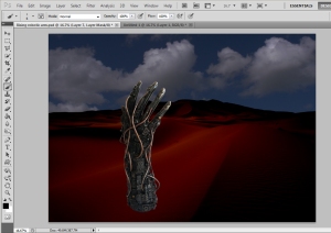
Firstly i imported the image of the techno hand (from deviant art) and added a layer mask so i can begin removing the background and making adjustments if needed.

Similar to the first one i added the desert image i got from deviant art and cut it out just so i had the sand texture, i then darkened the image using image, adjustments, brightness & contrast, levels, curves etc until i was satisfied with the result.

I then inserted clouds which i got from mayang’s textures, again i reduced the brightness & contrast so that it matched the same tone as the desert texture or close enough.

I saw another set of clouds whilst on mayang’s texture which i imported however i didn’t adjust the brightness or contrast because of the fact it was already quite dark due to the sunset, its as if the sand was reflected in the sky which gave it the orange type of fill but i quite liked it, however i wasn’t sure on which set of clouds to use.

I then began to start adding effects to the piece, what i did here was creating like a beam of light shining on the hand ( to signify a rising hand) that was done using the polygonal lasso tool i drew the shape i wanted and filled it with white and then added a Gaussian blur until i was satisfied, i then added a highlight to the first two fingers; this was done by using a soft medium brush about 250px i painted over where i wanted the highlights and then changed the blending mode to overlay which gave it the highlight effect (as if it came from the beam), i also added the shadow by just painting where i wanted it and using the Gaussian blur tool again until i was happy.

After i then added the fog effect i was after this was done by drawing where i wanted it with the rectangle marquee tool then filtered it with render clouds and changed the blending mode to lighten and reduced the opacity to 5% i done same again but placed the second layer below the hand so it had one on top and one on bottom this was the effect.

For this one i didn’t change any effects i just changed the clouds again because i wanted to see how it looked with the flourescent orange clouds i must admit it looks quite spooky but once again i will ask others which they feel is the best set of clouds for the piece.


Second Piece, In The Making

Originally i wanted to do a mixed media sort of piece (as previously expained on my previous post) so i attempted that initially. Here are the images.

My initial idea here was to have the frames overlay the images, but when looking through the frames you see a different perspective than the real life outside the frames, for example i was going to have within the frames part of it sketched, part of it a vector image, partly digital painted etc and other forms of media. After searching for so long i found an image which i thought i could use but it proved to be difficult and i also didn’t have enough technical skills to execute it properly so unfortunately i decided to leave the idea and move on, it’s a shame because i myself wanted to see how it would look finally but i guess gave up to easily.

Here is another image i was working on it was a lot more simpler but i still didn’t feel like i had enough technical skills to pull it off.

Second Piece

My idea for the second piece was to represent a world through a designer’s (in the making) eyes, as i wear glasses i thought it would be a good idea to portray what it would be like looking through a designer’s world, so everything within the glasses famre would be designed or giving an effect to and everything out of it would be reality.

Here are a few images that only slightly show my idea.

This slideshow requires JavaScript.

This is kind of the idea i wanted to do and I think the Electronic Earth album cover represents more (the most) of what i was aiming to do, although for my case if i was looking at a building (for example) through the glasses it would have an effect applied  to it for instance, part of it would be digitally painted, another part would be vexel or vector, another part would be sketched etc and outside of the frames you will just see the original building without any effects added so initially it would be a mixed media piece.


First Piece: Final

After careful consideration and asking other people’s opinion i decided to go for the slightly blue-tinted background i was originally thinking either this one or the one without any colour but majority of people i asked agreed with me so it stuck. Here is how the final one looks in the end.

This is what i was finally happy with. I adjusted the techno brushes as i felt it was one-sided as they were both to the right hand side, so i moved the top one to the left hand side and left the bottom one to the right, but then after judging it didn’t seem right so i put the top one back on the right and moved the bottom one to left hand side and after judging i felt it was a better suited that way.

First Piece: Experimentation

After experimenting i decided to keep the laser effect as it i felt it would tie in well with the theme, i continued experimenting with the background colour and here is how they finally looked.

This slideshow requires JavaScript.

Here i was experimenting with what would be the best look for the  background colour a slight red and blue in the corner and the bottom, a full on red background or a slightly tinted red, a full on blue background or a slightly tinted blue background, a red blue and purple over the image or no colour background at all i think what i will do is ask a number of people as im unsure which one to pick, im slightly favouring the one with no background colour and the slightly tinted blue one.

First Piece: Experimentation

After continuous experiments i didn’t know whether to have the laser or not so i continued playing, i also decided to add colour to the image to see if it would go well with the piece or not, i saved several versions here is how it it looks at the moment.

This slideshow requires JavaScript.

Here i was experimenting with what would be the best look, a background colour with a laser, a laser without a background colour or no laser and a background colour i think i will ask other people for their opinions  as im a bit stuck on which has the best effect. I chose the colours red and blue for the background because in some of the films/comics he wears the blue costume so i thought that was a relatable feature and his laser in the film/comics is red so that’s a reason i picked red.